


We're a design house built for bold ideas and modern brands. From concept to execution, we blend strategy with storytelling to build brands that connect, convert, and stand out in a noisy world.
Projects


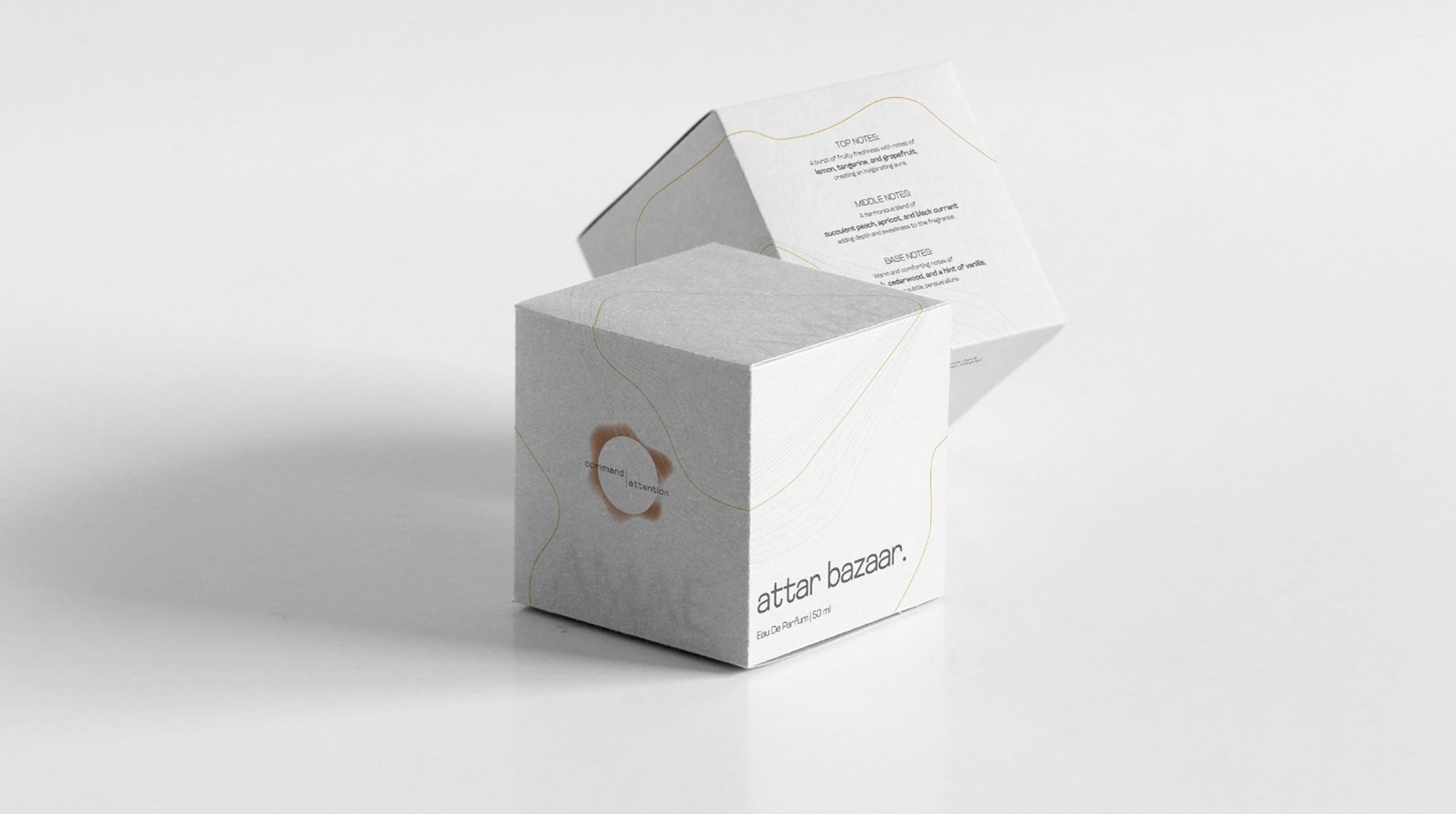
 1.png)


253,251,217
56°, 87%, 92%
0%, 0.8%, 14.2%, 0.8%

26, 22, 25
310°, 8%, 9%
0%, 15.4%, 3.8%, 89.8%

250, 246, 249
320°, 33%, 97%
0%, 1.6%, 0.4%, 2%


 Click to view brandbook
253,251,217
56°, 87%, 92%
0%, 0.8%, 14.2%, 0.8%
26, 22, 25
310°, 8%, 9%
0%, 15.4%, 3.8%, 89.8%
250, 246, 249
320°, 33%, 97%
0%, 1.6%, 0.4%, 2%
.png?updatedAt=1761288662903)
When we designed the logo, we imagined soft light, quiet elegance, and pieces that speak without saying too much. The result? A minimalistic mark that feels like a whisper in gold. Clean. Airy. Intentional. Just like the jewelry, the logo doesn't beg for attention—it earns it with grace. Designed to linger in memory, not just on paper.
 Click to view brandbook

The "AMAE" logo is a design triumph, blending an "empty A" with a customised serif typeface. The deliberate absence of a line in the first 'A' signifies openness, mirroring the emotional receptivity embedded in the Japanese concept. Connected AE letters convey unity and interdependence of the perfume, a visual manifestation of the brand's commitment to emotional bonds. The all caps, bold lettering exudes confidence, underlining the brand's assurance in delivering profound emotional experiences through its fragrances.
Click to view brandbook
.svg)
 Click to view brandbook

 Click to view brandbook


