Design House

We're a design house built for bold ideas and modern brands. From concept to execution, we blend strategy with storytelling to build brands that connect, convert, and stand out in a noisy world.

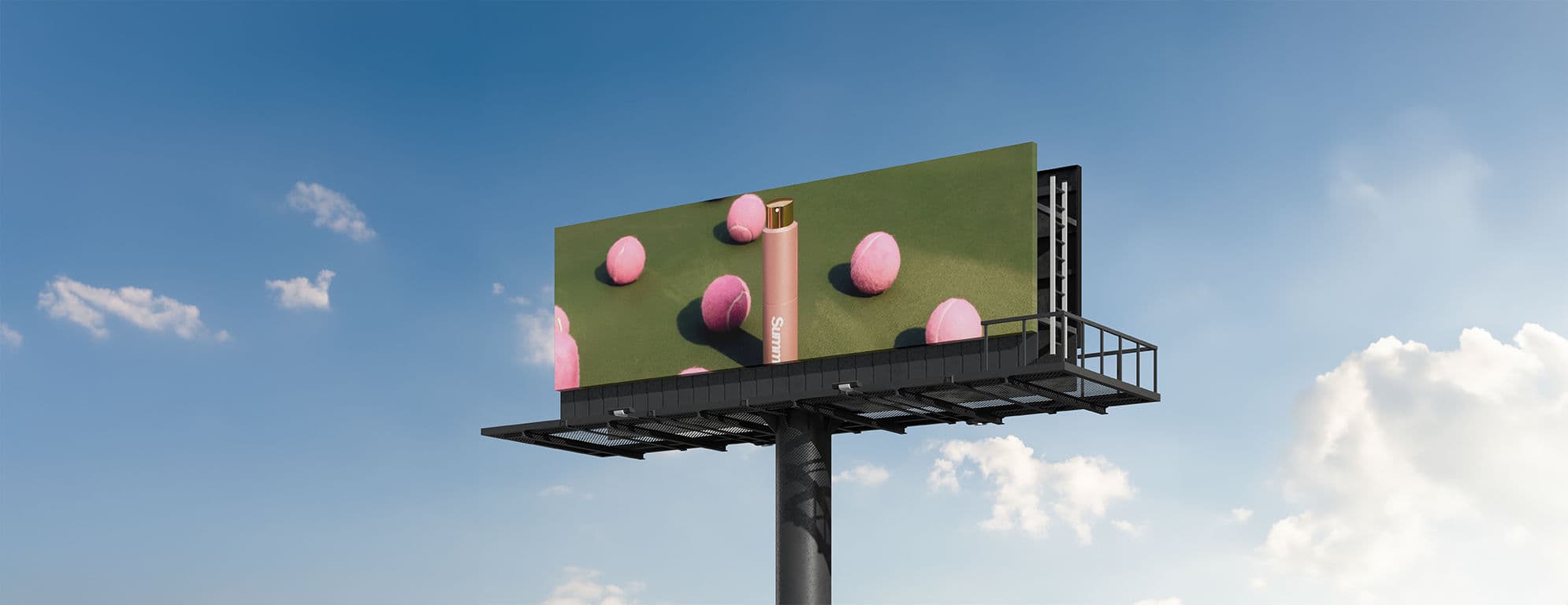
Eye-catching visuals for ads, websites, and product mockups. Artists use 3D tools to craft unique, collectible digital art. Visualize spaces before they're built. 3D environments for immersive shopping or brand experiences.

Every website we create is designed with international UI/UX standards so that your brand looks credible across any audience, anywhere in the world.

Projects

project-0
project-1
project-2
project-3

House of Ruh is a lifestyle brand that brings the timeless artistry of India to a global audience. Rooted in the vibrant heritage of Jaipur, the brandcelebrates traditional craftsmanship through thoughtfully designed carrywear featuring authentic Jaipuri prints.

The primary font used for heading is "Robodron". This remains consistent with the crypto space being decentralized and playing on its clarity.

The main logo consists of an icon and wordmark. The wordmark is minimal but reflective of the brand's long-term intentions with developing the crypto space. The main focus of the logo is the icon, and its use should reflect this.

new

Touching on the brand's concept of integrity and support Lightspeed Listing's color palette blends a vibrant and dimmed blue with greyscale for a simple yet effective palette which will be easy to utilize for the team.

Light Ivory

HEX

#FDFBD9

RGB

253,251,217

HSL

56°, 87%, 92%

CYMK

0%, 0.8%, 14.2%, 0.8%

Raisin Black

HEX

#1A1619

RGB

26, 22, 25

HSL

310°, 8%, 9%

CYMK

0%, 15.4%, 3.8%, 89.8%

Lavender Blush

HEX

#FAF6F9

RGB

253,251,217

HSL

56°, 87%, 92%

CYMK

0%, 0.8%, 14.2%, 0.8%

Caara isn’t just a jewelry brand—it’s a feeling.
When we designed the logo, we imagined soft light, quiet elegance, and pieces that speak without saying too much. The result? A minimalistic mark that feels like a whisper in gold. Clean. Airy. Intentional. Just like the jewelry, the logo doesn’t beg for attention—it earns it with grace. Designed to linger in memory, not just on paper.

Banner

At Vesenex, we help Australian businesses stay secure in a digital-first world. As a trusted MSSP, we deliver tailored cyber protection with 24/7 monitoring, threat detection, and rapid response powered by our expert SOC team and global best practices.

The "AMAE" logo is a design triumph, blending an "empty A" with a customised serif typeface. The deliberate absence of a line in the first 'A' signifies openness, mirroring the emotional receptivity embedded in the Japanese concept. Connected AE letters convey unity and interdependence of the perfume, a visual manifestation of the brand's commitment to emotional bonds. The all caps, bold lettering exudes confidence, underlining the brand's assurance in delivering profound emotional experiences through its fragrances.

AMAE Logo
Attar Bazzar
Perky paws

We built this logo & Packaging to make sure Playful Paws Meet Purrfect Products. We use vibrant purple (#6d00c2) and tangy orange (#ffb552) for our primary colors, playfully contrasted by a lineup of cool and techy tones that make up our supporting colors.

Pearky Paws